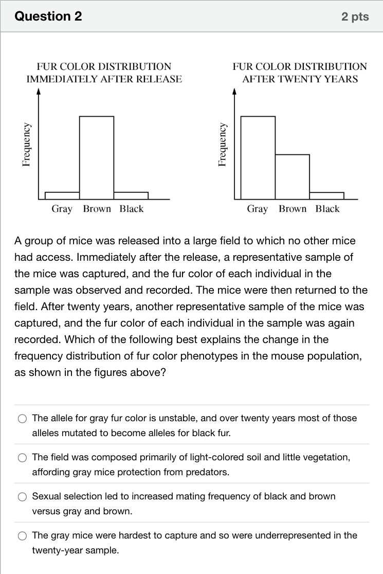
The first graph is titled fur color distribution immediately after release, with y-axis labeled frequency. There are three bars representing gray, brown and black mice. The gray and black mice have very low bars at low frequency, and the brown mice have a tall bar with high frequency. The second graph is titled fur color distribution after twenty years, with y-axis labeled frequency. The gray mice have the highest frequency, the brown mice have a mid-level frequency, and the black mice have very low frequency. A group of mice was released into a large field to which no other mice had access. Immediately after the release, a representative sample of the mice was captured, and the fur color of each individual in the sample was observed and recorded. The mice were then returned to the field. After twenty years, another representative sample of the mice was captured, and the fur color of each individual in the sample was again recorded. Which of the following best explains the change in the frequency distribution of fur color phenotypes in the mouse population, as shown in the figures above?单项选择题
A
The allele for gray fur color is unstable, and over twenty years most of those alleles mutated to become alleles for black fur.
B
The field was composed primarily of light-colored soil and little vegetation, affording gray mice protection from predators.
C
Sexual selection led to increased mating frequency of black and brown versus gray and brown.
D
The gray mice were hardest to capture and so were underrepresented in the twenty-year sample.
登录即可查看完整答案
我们收录了全球超50000道真实原题与详细解析,现在登录,立即获得答案。
类似问题
Of all the factors that can disrupt Hardy-Weinberg equilibrium, ______ is the only one that can change a population to be better suited to its environment.
Percent of Moths Recaptured in Two Different Environments Trial Moth Color and Environment Percent of Released Moths Recaptured I Light-colored moths were released in an unpolluted environment. 13% II Light-colored moths were released in a polluted environment. 12% III Dark-colored moths were released in an unpolluted environment. 7% IV Dark-colored moths were released in a polluted environment. 28% A researcher released large numbers of moths into different environments in an attempt to better understand a mechanism of evolution. The moths were released in four trials as described in the table above. Each of the released moths had a small mark on the underside of a wing for identification. After an appropriate amount of time, the researcher recaptured as many of the released moths as possible. Data from the experiment are included in the table above. Which of the following claims is best supported by the data?
In Darwinian terms, the fittest individuals of a species are those that
Which of the following is probably the best explanation for the fact that Antarctic penguins cannot fly, although there is evidence that millions of years ago their ancestors could do so?
更多留学生实用工具
希望你的学习变得更简单
加入我们,立即解锁 海量真题 与 独家解析,让复习快人一步!