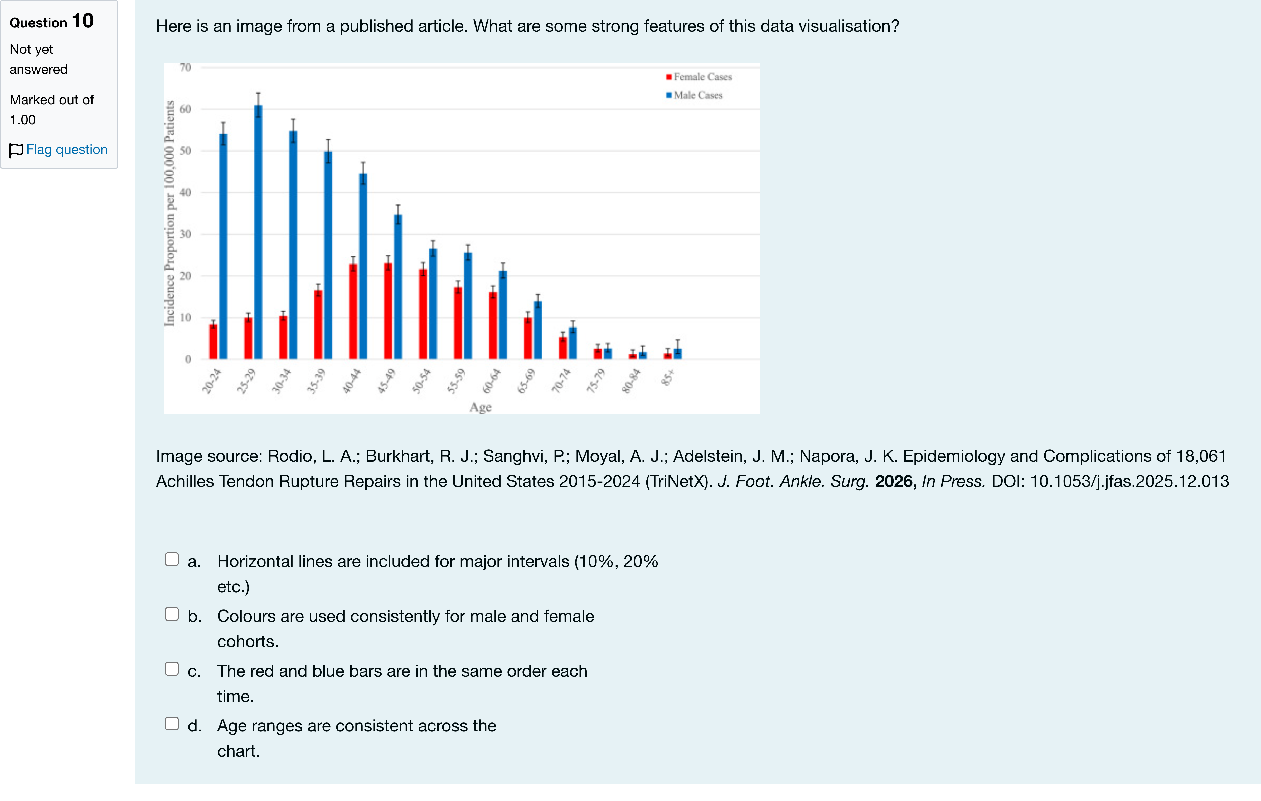
Here is an image from a published article. What are some strong features of this data visualisation? Image source: Rodio, L. A.; Burkhart, R. J.; Sanghvi, P.; Moyal, A. J.; Adelstein, J. M.; Napora, J. K. Epidemiology and Complications of 18,061 Achilles Tendon Rupture Repairs in the United States 2015-2024 (TriNetX). J. Foot. Ankle. Surg. 2026, In Press. DOI: 10.1053/j.jfas.2025.12.013多项选择题
A
a. Horizontal lines are included for major intervals (10%, 20% etc.)
B
b. Colours are used consistently for male and female cohorts.
C
c. The red and blue bars are in the same order each time.
D
d. Age ranges are consistent across the chart.
登录即可查看完整答案
我们收录了全球超50000道真实原题与详细解析,现在登录,立即获得答案。
类似问题
Which of the following is an irresponsible practice in graphic presentation?
Identify two appropriate chart types to visualize the distribution of the variable: BusinessMajor[Fill in the blank]
What would be the appropriate visualization tool(s) for “Area”?[Fill in the blank]
At a campus political debate, a sample of audience members was asked to state whether they voted in the last Presidential election. The responses are shown in the following table: Voted Frequency Yes 45 No 12 Prefer not to answer 79 How would I best display this data? Select all that apply.
更多留学生实用工具
希望你的学习变得更简单
加入我们,立即解锁 海量真题 与 独家解析,让复习快人一步!